

A Frutiger Aero PFP is a profile picture built from the glossy, blue-gradient, nature-meets-technology visual language that defined mainstream tech design between 2004 and 2013 — think Windows Vista’s Aero glass, bubbles, water droplets, and bright skies. It works as an avatar because it reads instantly as optimistic, clean, and nostalgic, even at the small circular size used by Discord, TikTok, and Instagram.
Avatars carry more identity weight than most people realize. Before anyone reads a bio or a single message, the profile image has already set a tone — calm, playful, curated, chaotic, or forgettable. That’s why niche aesthetic movements keep resurfacing as PFP trends: they give people a ready-made visual shorthand instead of forcing them to invent one from scratch.
Frutiger Aero specifically has surged back because it fills a gap that flat, minimal app icons left behind. Where modern UI design flattened everything into solid colors, this aesthetic brings back skeuomorphic gloss, aurora skies, transparent bubbles, and humanist Frutiger-style type — details that feel tactile and a little dreamy in a feed otherwise full of flat design.
Why A Well-Chosen PFP Shapes Your Online Presence
A profile picture is a trust and taste signal that lands before any text does. On Discord servers, TikTok comments, and Pinterest boards, people scan avatars in a fraction of a second, and that glance shapes how much attention a username or comment gets afterward.
Consistency compounds this effect. An account that reuses one visual language — the same palette, the same gloss, the same mood — reads as intentional rather than accidental, which builds recognizability across servers, group chats, and repeat interactions. Aesthetic coherence functions like a mini brand identity, even for a personal account with no commercial goal.
Frutiger Aero specifically leans on calming blue-green palettes, soft light flares, and rounded glass shapes, so it tends to read as approachable rather than aggressive. That makes it a strong pick for community-facing profiles — Discord mods, Pinterest curators, or TikTok accounts built around a soft, nostalgic, tech-optimist mood board.
Frutiger Aero PFP Aesthetic

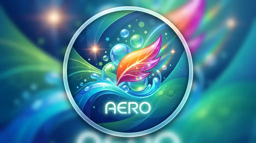


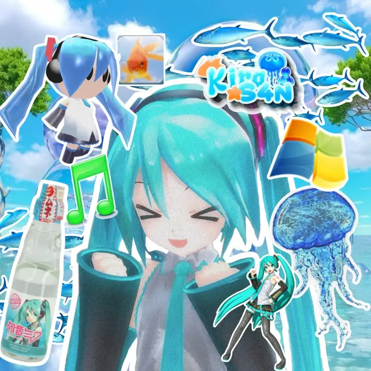
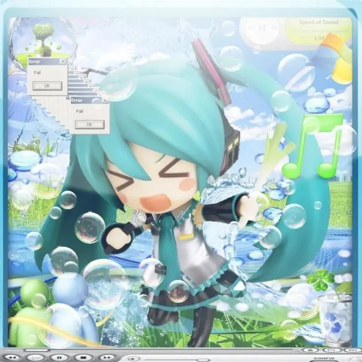

The core Frutiger Aero PFP aesthetic combines glossy skeuomorphism, aqua-to-cobalt gradients, and nature motifs like water, sky, and bubbles into one small, circle-safe composition. This is the umbrella style every sub-variant below borrows from — it’s the “default” version of the trend before it’s pushed toward minimal, dreamy, retro-tech, or Y2K directions.
What separates a convincing Frutiger Aero image from a generic blue gradient is the layering: a glass-like highlight sitting over a soft color field, with at least one organic element (a bubble, a droplet, a leaf, a cloud) breaking up the geometry. Humanist sans-serif type in the Frutiger family, if any text appears, reinforces the era-accurate feel.
This aesthetic performs well on Discord, TikTok, Instagram, Pinterest, and X, where it pairs naturally with soft-blue banners, minimalist usernames, and retro-tech bios. It’s most legible when the composition avoids clutter, since fine gloss detail can disappear once an image shrinks to icon size.
Frutiger Aero Profile Picture



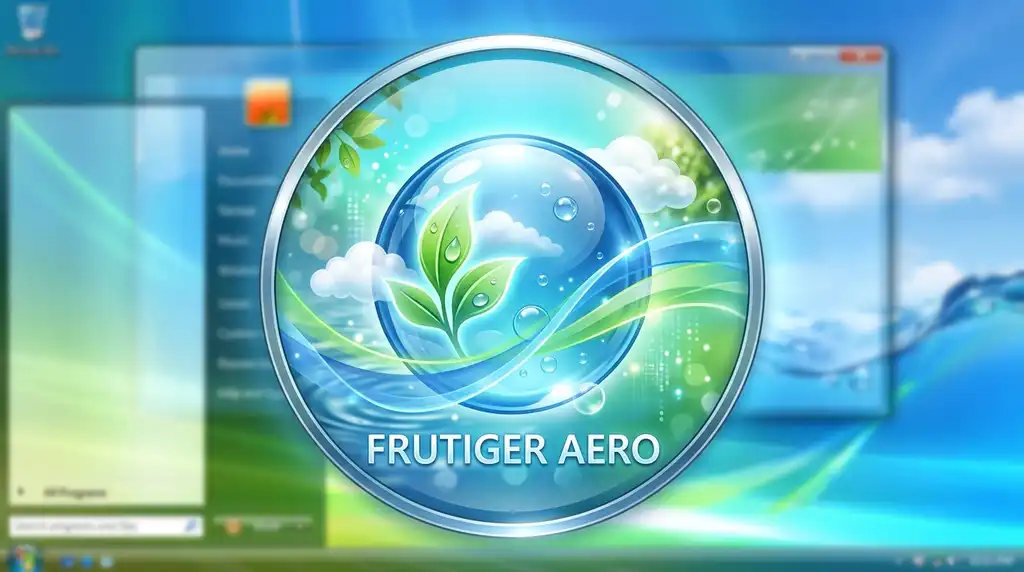

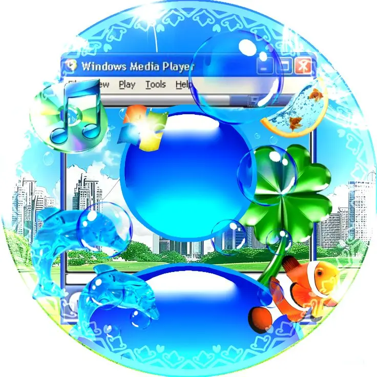
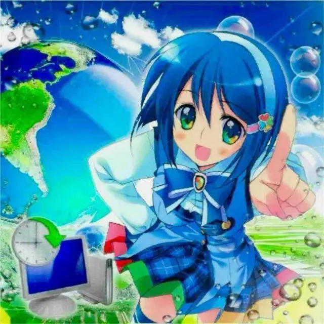
A Frutiger Aero profile picture prioritizes one clear glossy focal point over a busy scene, since profile circles crop aggressively and hide peripheral detail. The strongest examples use a single bubble, orb, or glass shape centered in the frame, with the blue-toned background doing the atmospheric work.
Cropping matters more here than in almost any other aesthetic category, because Aero-style gloss and reflections rely on smooth gradients that break down under heavy compression or off-center cropping. A profile picture built specifically for this purpose — rather than a wallpaper cropped after the fact — holds up far better across platforms.
These avatars fit Discord, TikTok, Instagram, Pinterest, and gaming profiles particularly well, especially alongside tech-inspired bios, blue-toned banners, and clean, lowercase usernames that don’t compete visually with the gloss.
Frutiger Aero HD


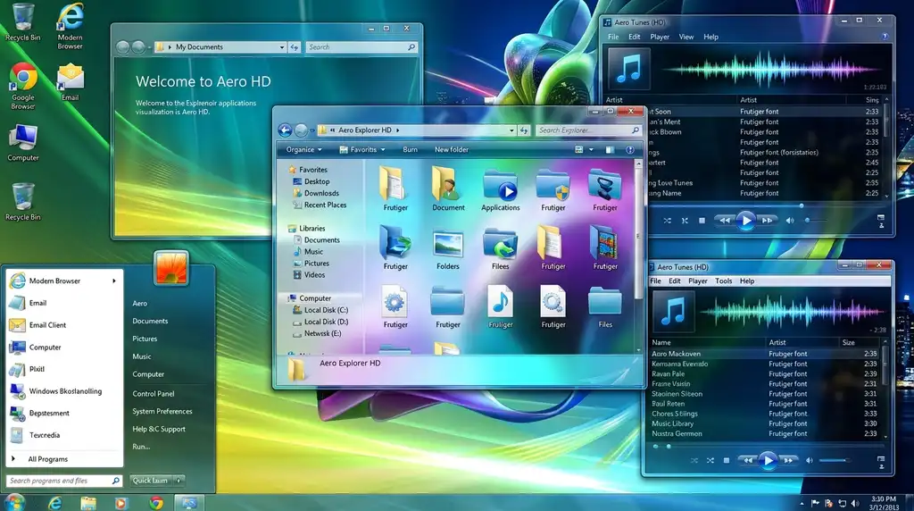

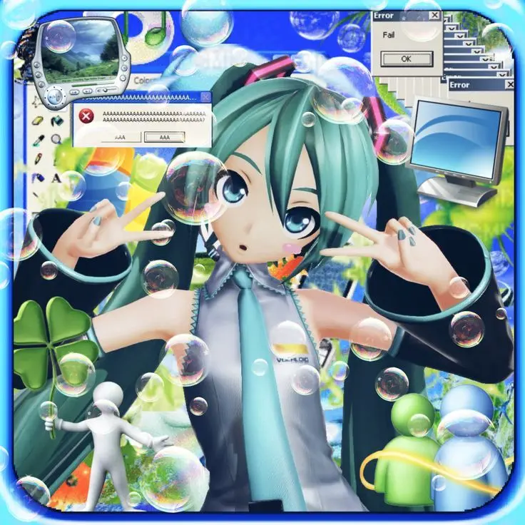

HD Frutiger Aero avatars prioritize resolution high enough to keep gradients smooth and edges clean after every platform recompresses the upload. Most social apps strip detail from low-resolution images first, so starting from an HD source (at minimum 1080×1080px) protects the gloss and gradient work that defines the style.
Sharper source files also mean subtler details — light flares, droplet reflections, faint bubble seams — actually survive being shrunk to a 32–64px icon. Lower-resolution images tend to flatten into a muddy blue blur at that size, losing exactly the polish that makes the aesthetic recognizable.
HD versions work across Discord, TikTok, Instagram, Pinterest, and X for anyone who wants dependable image quality with a consistent, nostalgic tech mood across bios, banners, and feed grids.
Frutiger Aero 4K
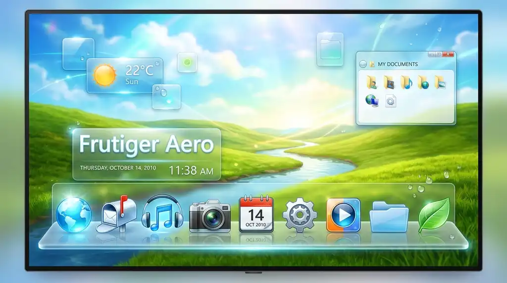


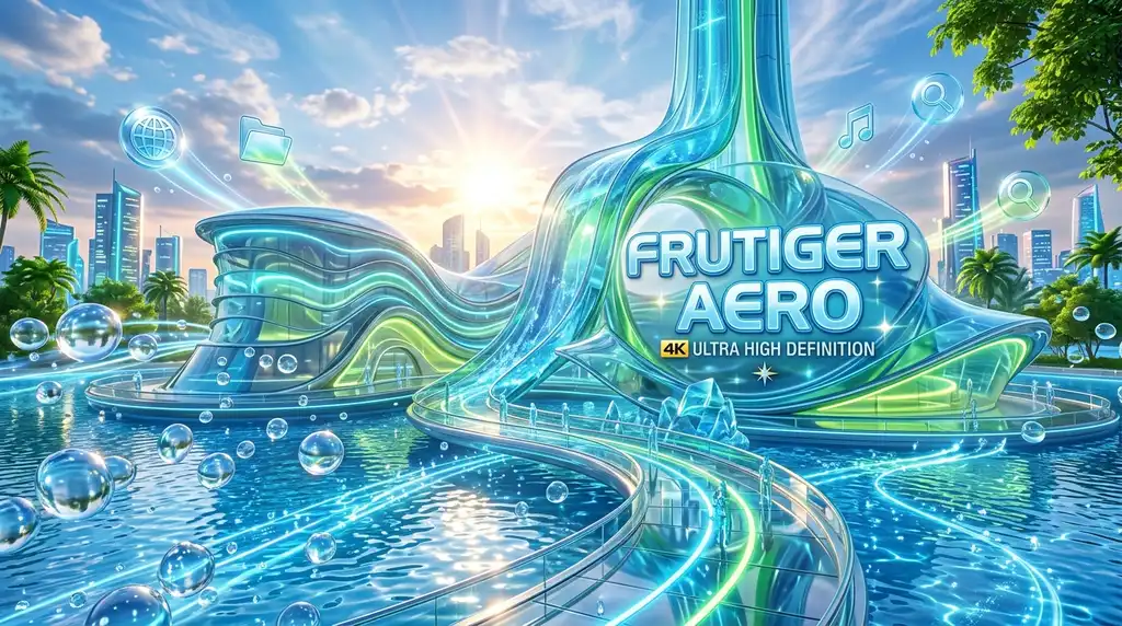


4K Frutiger Aero images push resolution further for use as source material — cropped into an avatar, but also usable as a matching wallpaper or banner. At this resolution, fine gloss detail, layered transparency, and light refraction hold up even under close inspection, which matters for anyone building a full aesthetic system rather than a single avatar.
The trade-off is file size and platform recompression: most apps will downscale a 4K upload anyway, so the resolution mainly matters for the source file used to generate a properly cropped, icon-ready export.
4K sources are most useful for creators building coordinated Instagram, TikTok, Pinterest, and Discord identities — one 4K image can be cropped into a PFP, a banner, and a wallpaper, keeping the whole profile visually unified.
Frutiger Aero Gradient Blue PFP




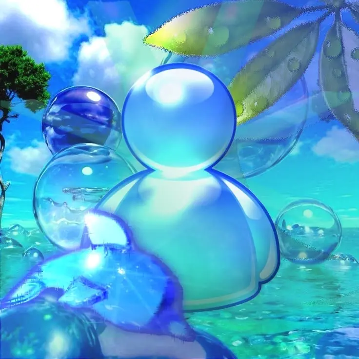
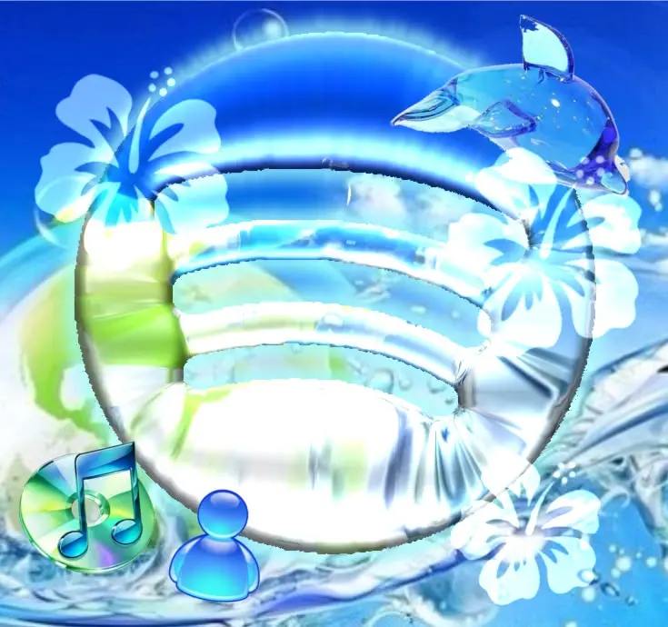
Gradient Blue PFPs isolate the single element every Frutiger Aero sub-style shares — a smooth cyan-to-cobalt transition — and make it the entire composition. This is the most color-driven version of the trend, using minimal texture and letting the gradient itself carry the mood.
| Gradient Type | Visual Mood | Best Platform Fit |
|---|---|---|
| Cyan-to-white | Bright, airy, daytime | TikTok, Pinterest |
| Cobalt-to-navy | Deep, calm, evening | Discord, X |
| Aqua-to-teal | Fresh, nature-leaning | Instagram, Pinterest |
Because there’s little competing detail, gradient-only avatars are among the most resilient to compression and cropping — they hold their shine at any size, from a 4K banner down to a 24px chat icon, which is why they’re a reliable default pick.
Frutiger Aero Abstract PFP

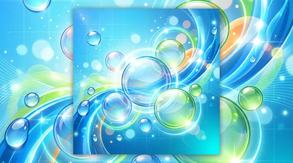
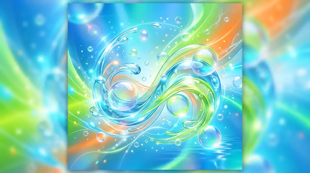
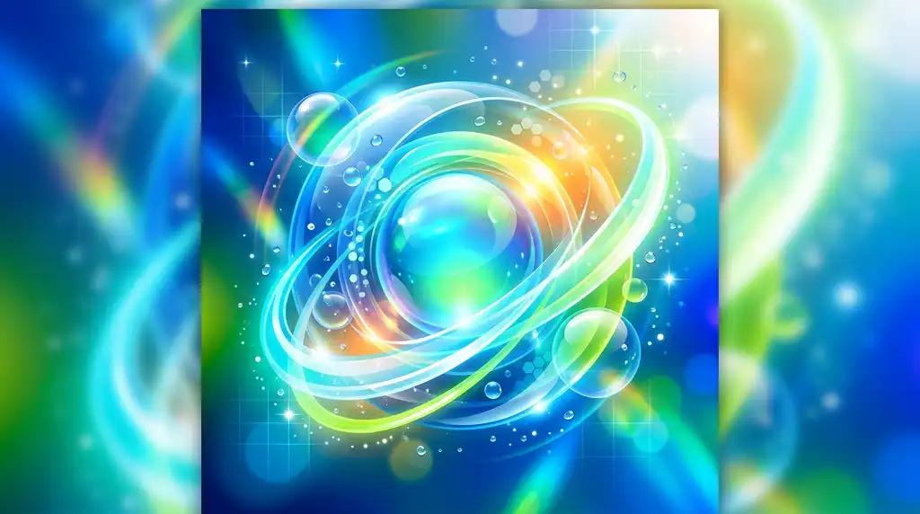
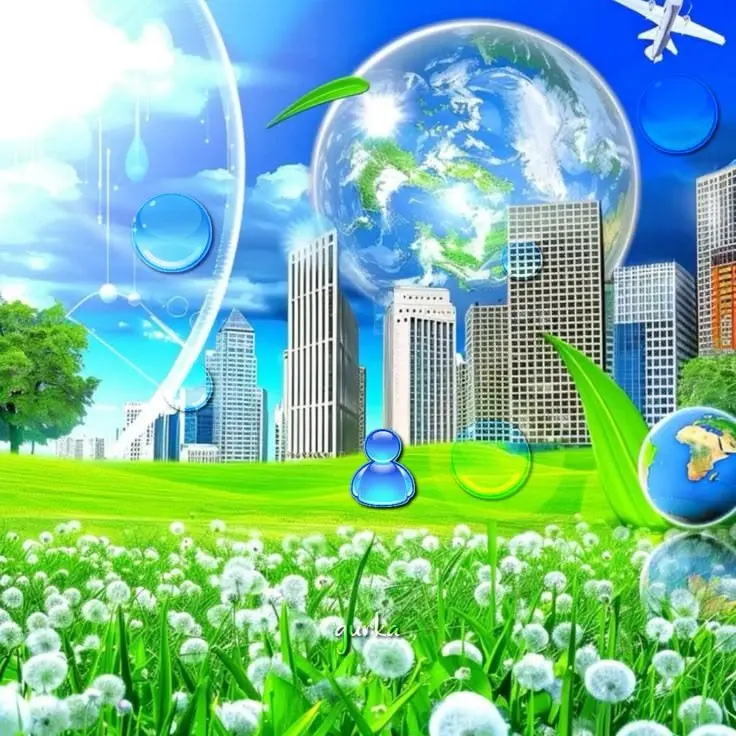


Abstract Frutiger Aero PFPs replace recognizable objects with floating curves, layered bubbles, and translucent shapes, keeping the aesthetic’s mood without any single “subject.” This suits accounts that want the visual language of the trend without committing to a literal bubble, droplet, or sky image.
Because there’s no fixed focal object, abstract compositions rely more heavily on rhythm — repeated curves, staggered transparency layers, and negative space — to avoid looking cluttered or random once cropped into a circle.
This style fits Discord, Pinterest, Instagram, TikTok, and X profiles built around a design-forward or moodboard identity, pairing naturally with minimal bios and clean, tech-adjacent usernames.
Frutiger Aero Retro Tech PFP
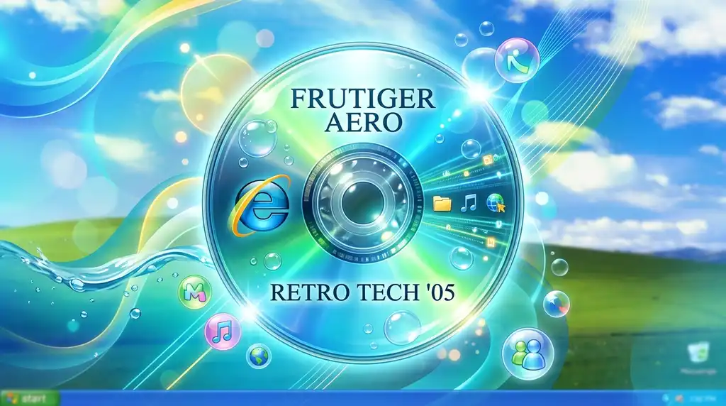
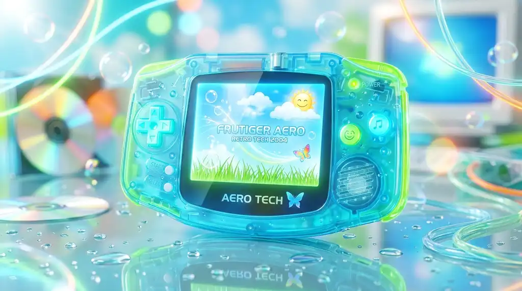
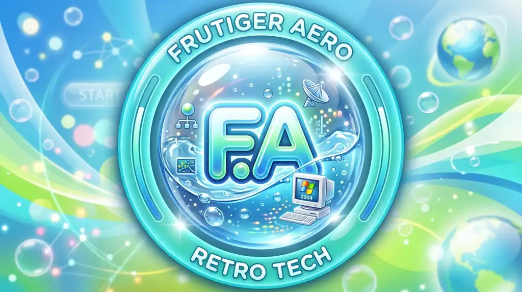


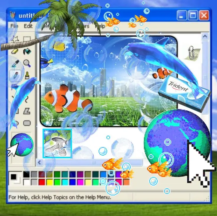
Retro Tech PFPs lean directly into 2005–2010 interface nostalgia — glass buttons, blue-green skeuomorphic panels, and the rounded, glossy UI language of Windows Vista and early Web 2.0. This is the most overtly “nostalgic software” branch of the aesthetic, closer to interface screenshots than nature photography.
The giveaway details are interface-specific: bevelled buttons, drop shadows under glass panels, and the kind of saturated blue-green palette seen in old media players and OS themes. Getting these details right is what separates a retro-tech image from a generic blue gradient.
This sub-style performs especially well with Y2K-themed bios, desktop-screenshot banners, and retro usernames on Discord, TikTok, Instagram, and Pinterest.
Frutiger Aero Minimal PFP


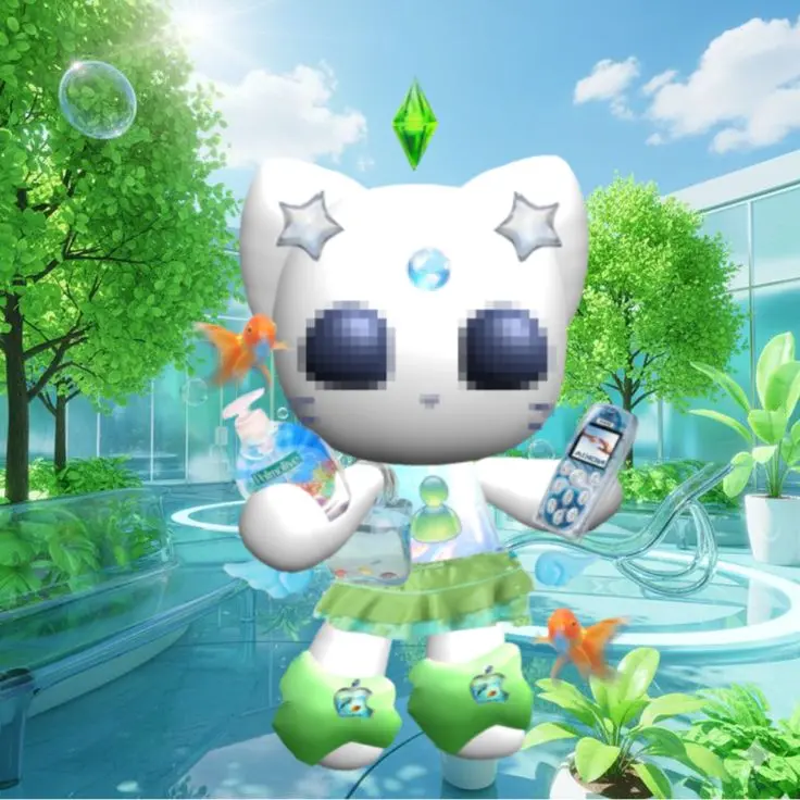
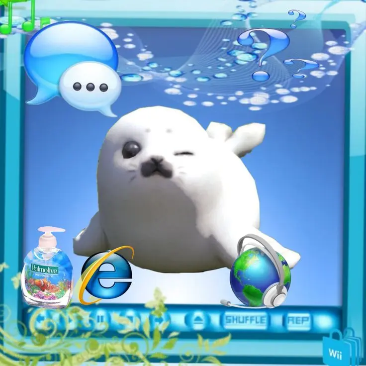

Minimal Frutiger Aero PFPs strip the aesthetic to one gradient, one soft highlight, and generous negative space, trading detail for instant legibility at any size. This is the version best suited to profiles that want the mood of the trend without visual noise competing with a username or bio.
Because there’s so little detail to lose, minimal versions survive aggressive platform compression better than any gloss-heavy variant — a real advantage for accounts that get recompressed repeatedly across reposts and shares.
Minimal styles suit Instagram, Discord, TikTok, Pinterest, and any more professional-leaning creative profile that still wants a soft, calming visual identity.
Frutiger Aero PFP Border





A Frutiger Aero PFP border adds a glossy, glass-ring frame around the avatar itself, turning the frame into part of the identity rather than an afterthought. This works especially well for Discord servers running a shared visual theme across member avatars.
The frame needs restraint: an overly thick or busy border competes with the circular platform crop and can push the actual subject out of frame. A thin, translucent glass ring with a subtle gradient outline tends to read best.
Border styles fit Discord, Instagram, TikTok, Pinterest, and X gaming profiles, pairing well with matching banners and coordinated server themes.
Frutiger Aero Wallpaper
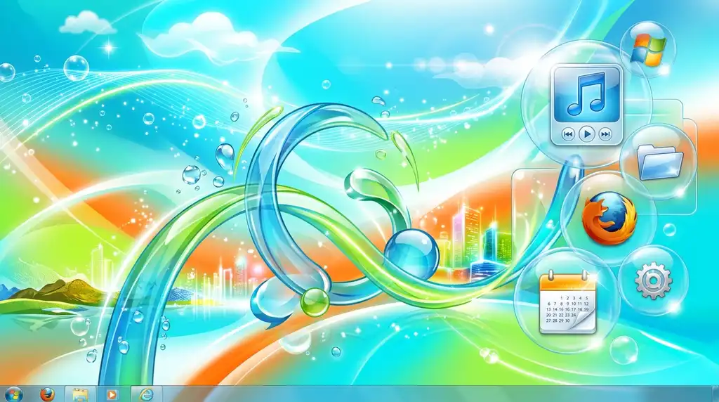
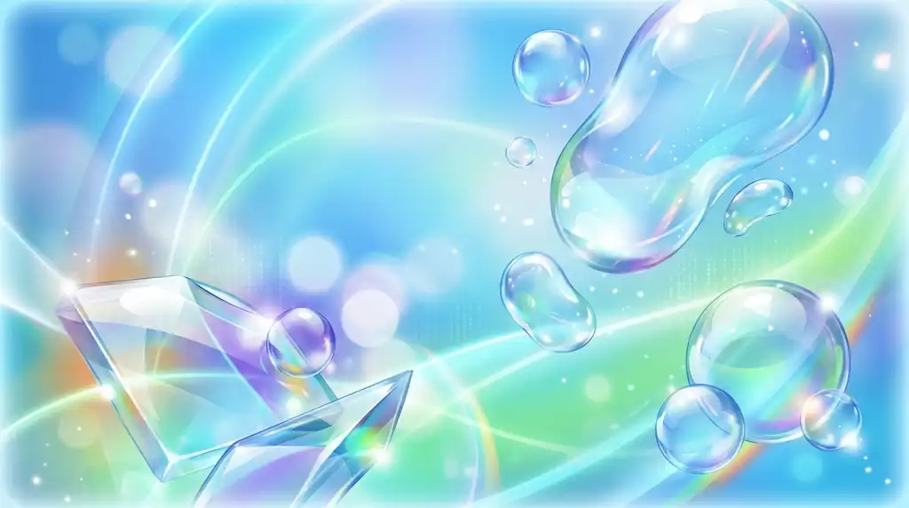
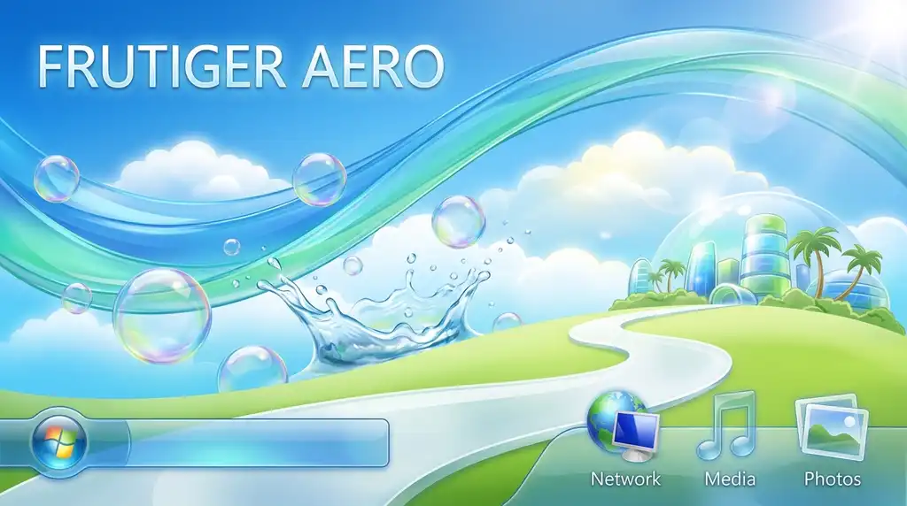



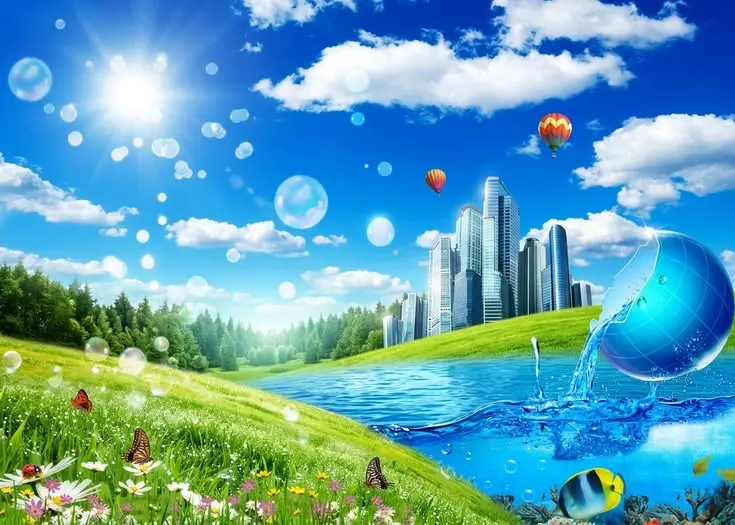
Frutiger Aero wallpapers are wide-format scenes — skies, water, bubbles, green fields — that need re-cropping, not direct uploading, before they work as a PFP. The wide composition that makes a wallpaper feel expansive is exactly what makes it unreadable once squeezed into a small circle.
The fix is simple: identify the single strongest focal point in the wallpaper (usually a bubble, a sun flare, or a water reflection) and crop tightly around it, discarding the wide atmospheric space that a wallpaper depends on.
Wallpaper-derived avatars suit Pinterest, Instagram, TikTok, Discord, and X profiles that want a matching lock-screen-to-avatar system built around one cohesive scene.
Frutiger Aero Background







Background-style Frutiger Aero images spread color and atmosphere across the whole frame — open sky, water reflection, gradient field — rather than centering one hero object. They work as a PFP when the center third of the image stays visually calm enough to survive circular cropping.
The risk with background-driven avatars is emptiness reading as blandness at icon size; a faint gradient with no highlight or texture can disappear into a solid blue circle once shrunk down, so at least one subtle detail near the center helps it stay recognizable.
These images suit Discord, Pinterest, TikTok, Instagram, and X profiles that favor atmosphere over a literal subject.
Frutiger Aero Icon PFP
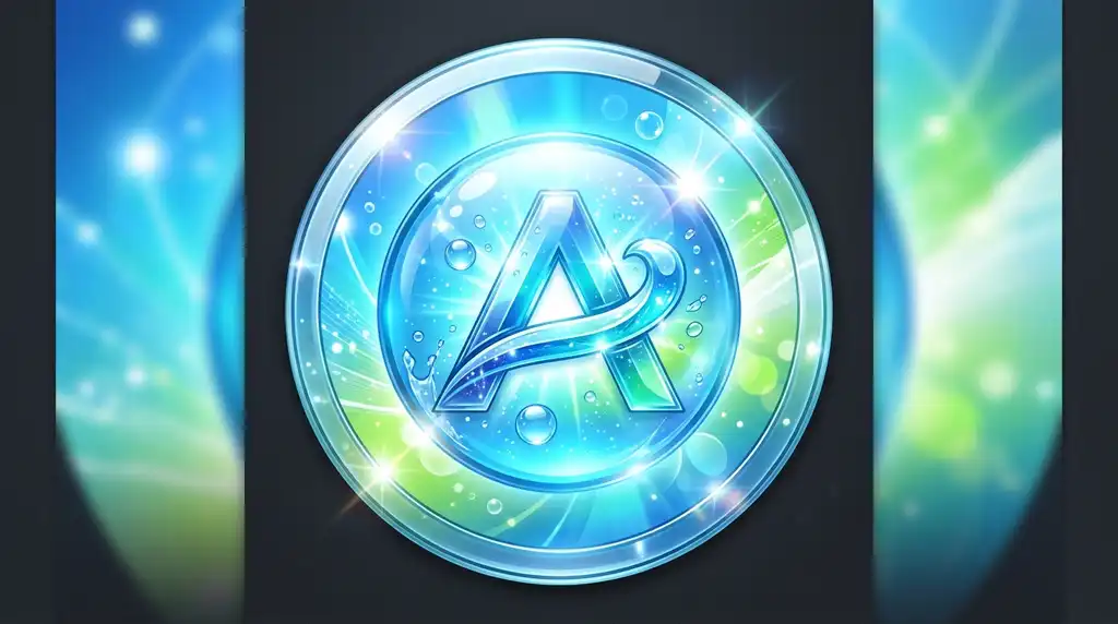




Icon-optimized Frutiger Aero PFPs are designed from the start for small-size legibility — strong contrast, one centered subject, and no fine detail that vanishes below 64px. This is less a visual sub-style and more a technical constraint applied to any of the looks above.
Bold, simple shapes always outperform intricate gloss detail at icon size. A single glass bubble with a clean highlight reads instantly on a Discord member list; a busy scene with five small elements turns into a blur.
Icon-ready crops matter most for Discord servers, private chats, gaming groups, and any surface where the avatar displays at 32–64px rather than full size.
Frutiger Aero Blue Bubble PFP




Blue Bubble PFPs use a single transparent sphere with an aqua highlight and a soft drop shadow as the entire subject, making the bubble itself the brand. This is one of the most iconic and recognizable single-object versions of the aesthetic.
The realism of the bubble depends on light logic: a consistent highlight direction, a faint rim light, and a shadow grounding the sphere against the background sell the glass-and-air effect far more than an evenly lit, flat circle would.
Blue Bubble avatars fit Discord, TikTok, Instagram, Pinterest, and X profiles that want one strong, instantly recognizable glossy symbol rather than a full scene.
Frutiger Aero Glassmorphism PFP





Glassmorphism PFPs merge modern frosted-glass UI design with classic Frutiger Aero softness, layering blurred, translucent panels over blue-green gradients. This is the bridge sub-style connecting 2007-era Aero glass to 2020s app-design trends, which is part of why it resonates with a design-literate audience.
Depth is the whole game here: multiple semi-transparent layers, each blurred slightly differently, create the illusion of stacked glass panes rather than one flat translucent overlay.
Glassmorphism suits Discord, Instagram, TikTok, Pinterest, and X accounts run by designers, developers, or anyone whose bio references UI/UX, interface design, or digital product work.
Frutiger Aero Water Drop PFP




Water Drop PFPs zoom into a single droplet — its refraction, its highlight, its shadow — as a compact, endlessly reusable Frutiger Aero symbol. The extreme close-up format makes this one of the easier sub-styles to keep sharp at icon size, since there’s only one object to preserve detail on.
Refraction is the detail that sells it: a droplet should visibly bend or magnify whatever’s behind it slightly, which is what separates a convincing water drop from a plain glossy circle.
This style suits Instagram, Discord, TikTok, Pinterest, and X profiles built around a calm, minimalist, nature-adjacent mood.
Frutiger Aero Nature PFP
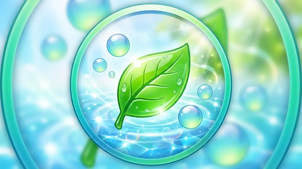




Nature-leaning Frutiger Aero PFPs blend blue sky, green grass, leaves, and sunlight with the aesthetic’s signature gloss, softening the trend’s tech-forward edge. This variant leans on the “Authentic” and “Reflective” pillars behind the AERO acronym more than the strictly digital sub-styles do.
Balance matters: too much natural texture and the image reads as a plain landscape photo; too much gloss and the nature imagery gets lost under digital-looking highlights. The strongest examples keep both elements clearly present.
Nature PFPs fit Pinterest, Instagram, Discord, TikTok, and X profiles built around an eco-aesthetic, cottagecore-adjacent, or optimistic-tech mood.
Frutiger Aero Sky PFP


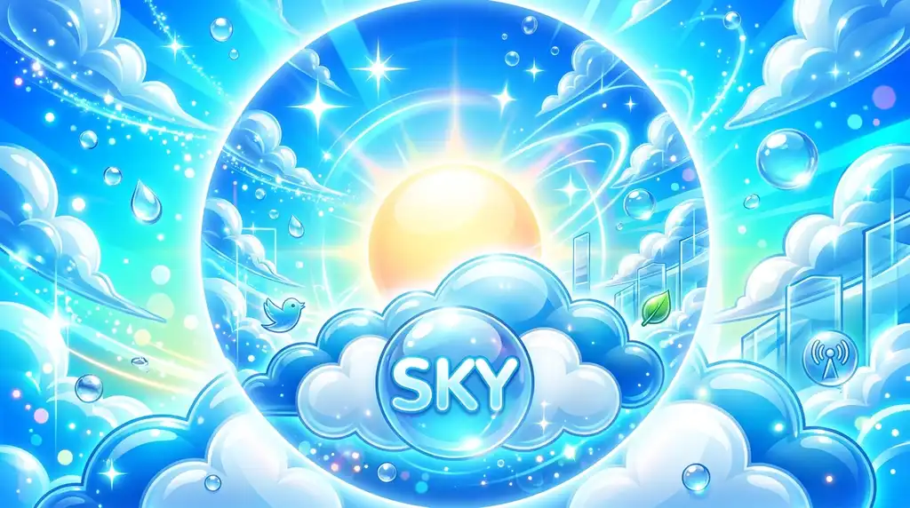

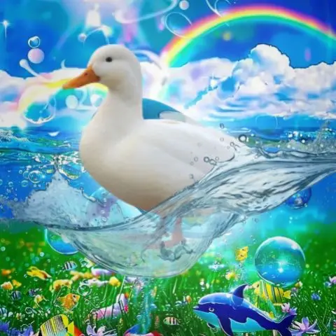

Sky-focused Frutiger Aero PFPs use open blue space, soft clouds, and light flares to create an airy, spacious avatar even inside a small circular crop. Because the subject matter is inherently wide and atmospheric, sky imagery needs a deliberate focal point — a sun flare or a cloud break — to avoid reading as an empty blue square once cropped.
Light flares specifically are a strong identifier of this era’s design language, referencing the lens-flare-heavy stock photography and UI backgrounds common between 2005 and 2011.
Sky PFPs suit Instagram, Pinterest, TikTok, Discord, and X accounts that want a lighter, more optimistic mood than the deeper gradient-blue or retro-tech variants.
Frutiger Aero Y2K PFP


Y2K-leaning Frutiger Aero PFPs push gloss and bubble detail further toward the earlier, brasher 2000-2004 Y2K Futurism aesthetic that Frutiger Aero directly succeeded. The two trends are frequently confused, but Y2K imagery tends to be lower-fidelity and more saturated, while true Frutiger Aero is higher-definition and more restrained.
Knowing this distinction matters for search accuracy: someone hunting specifically for early-2000s chrome-and-bubble imagery wants Y2K, while someone after Windows Vista-era gloss wants classic Frutiger Aero — the styles overlap but aren’t interchangeable.
This crossover style fits Discord, TikTok, Instagram, Pinterest, and X retro-aesthetic profiles that reference both eras interchangeably.
Frutiger Aero Dreamy PFP

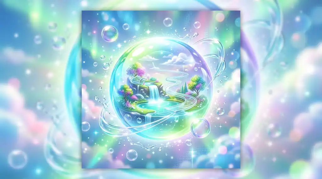


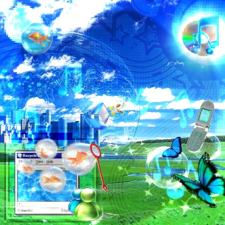
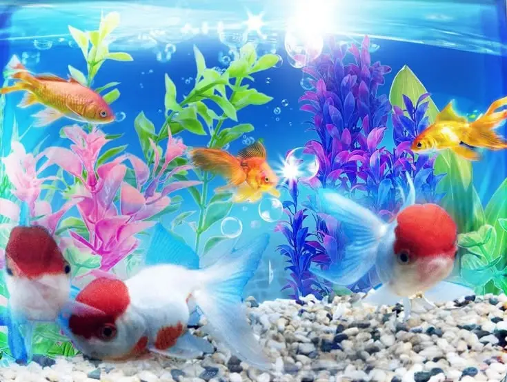

Dreamy Frutiger Aero PFPs add blur, glow, and pale desaturated tones to the aesthetic, trading crisp gloss for a softer, hazier emotional register. This is the version furthest from the original’s sharp, high-definition UI roots, closer to a soft-focus photo edit than a rendered interface graphic.
The mood depends on restraint in contrast: pushing brightness and blur too far erases the recognizable bubble and gradient shapes that anchor the style, so a light hand keeps it dreamy rather than shapeless.
Dreamy PFPs suit Pinterest, Instagram, Discord, TikTok, and X soft-aesthetic profiles built around a gentle, low-energy mood.
Frutiger Aero Clean Aesthetic PFP


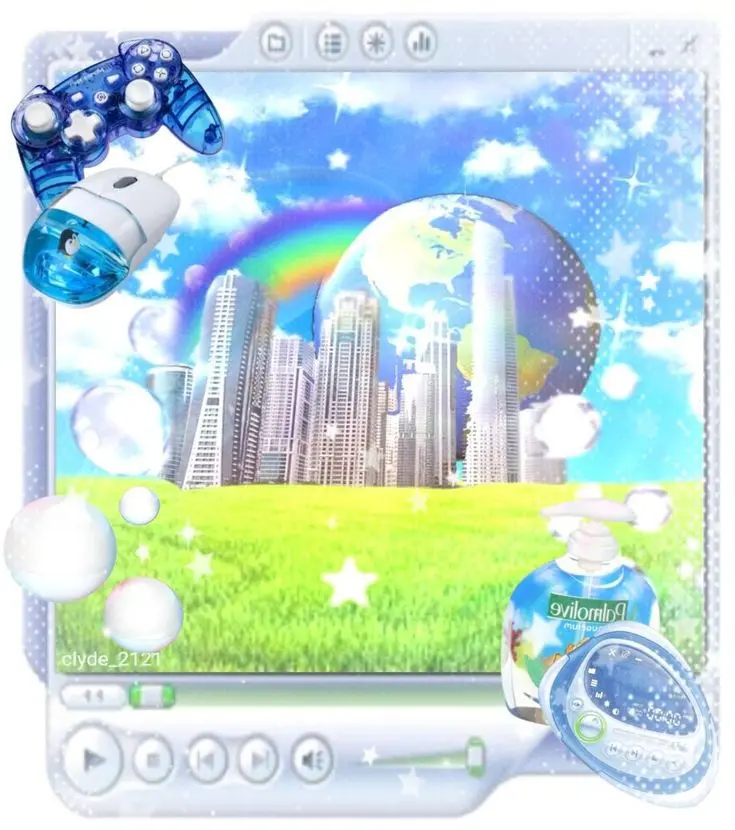
Clean Aesthetic PFPs pair Frutiger Aero’s blue-gloss palette with a more contemporary, uncluttered layout, making the nostalgic look feel current rather than dated. This variant borrows restraint from modern minimalist design while keeping the gradient and gloss cues that make the aesthetic recognizable.
The balance point is discipline: enough gloss to signal Frutiger Aero, but enough open space and simple geometry to read as a 2026-appropriate avatar rather than a screenshot from an old OS theme.
This style suits Instagram, Discord, TikTok, Pinterest, and X profiles aiming for a modern-meets-nostalgic identity.
Frutiger Aero Digital PFP

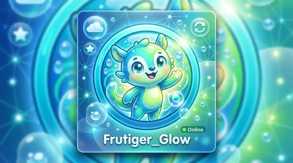


Digital-styled Frutiger Aero PFPs lean into interface shapes directly — panels, glass buttons, transparent layers — foregrounding the aesthetic’s software-culture roots. This sub-style sits closest to literal UI mockups, more structured and geometric than the nature- or water-driven variants.
Because this version references actual interface conventions, getting proportions and bevel/shadow logic right (rather than just applying a blue gradient) is what makes it read as intentional rather than generic.
Digital PFPs fit Discord, Instagram, TikTok, Pinterest, and X tech-centered profiles, pairing well with interface-referencing bios and banners.
Frutiger Aero Soft Blue PFP




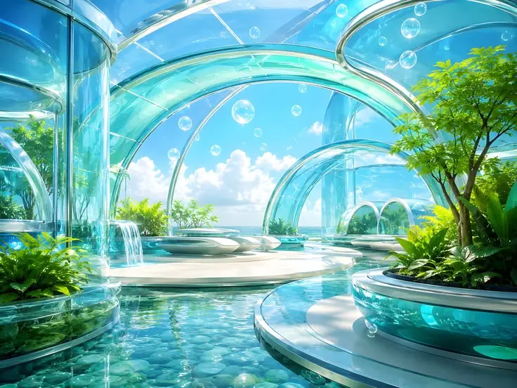
Soft Blue PFPs use pale, low-contrast blue tones and gentle highlights to create the calmest, quietest version of the aesthetic. Where gradient-blue and retro-tech variants lean saturated and bold, soft blue deliberately mutes the palette for a gentler visual effect.
Low contrast is a double-edged design choice: it reads as soothing on a full-size image but can wash out entirely at icon size, so a soft-blue avatar benefits from at least one slightly stronger highlight to anchor focus once it’s small.
Soft Blue PFPs suit Instagram, Discord, TikTok, Pinterest, and X profiles favoring a gentle, low-key digital mood.
Frutiger Aero PFP Style Comparison
| Style | Core Visual Cue | Best For |
|---|---|---|
| Gradient Blue | Smooth cyan-cobalt fade | Fast, reliable icon at any size |
| Glassmorphism | Layered frosted panels | Design/dev-focused profiles |
| Retro Tech | Vista-era glass buttons | Strong nostalgia, Y2K crossover bios |
| Blue Bubble | Single glass sphere | Discord and gaming avatars |
| Dreamy | Blur, glow, pale tone | Soft, low-energy aesthetic feeds |
How To Choose The Right Frutiger Aero PFP
- Pick a source image at least 1080×1080px so gloss and gradients survive recompression.
- Center one clear focal object — a bubble, droplet, or glass shape — rather than a busy wide scene.
- Match saturation to platform: bolder gradient-blue for Discord/gaming, softer or dreamy tones for Pinterest/Instagram.
- Test the crop at icon size (roughly 64px) before finalizing, since fine detail disappears first.
- Coordinate with banner and bio so the avatar reads as one deliberate visual system, not an isolated image.
- Choose Y2K or retro-tech variants specifically when nostalgia, not just color, is the goal.
Frequently Asked Questions
What’s the difference between Frutiger Aero and Y2K aesthetics?
Y2K Futurism came first and favors lower-fidelity, more saturated chrome and bubble imagery, while Frutiger Aero (2004–2013) is higher-definition, more restrained, and rooted in real interface design like Windows Vista’s Aero glass.
Is Frutiger Aero the same as glassmorphism?
No — glassmorphism is a modern UI design trend using frosted, translucent panels, but it directly borrows from Frutiger Aero’s earlier glass-and-gloss visual language, making the two closely related rather than identical.
What makes a Frutiger Aero PFP look good at a small size?
A single centered focal object, strong contrast between the subject and background, and minimal fine detail — since intricate gloss and small highlights tend to disappear once an avatar shrinks to icon size on Discord or TikTok.
Can I make a Frutiger Aero PFP from a wallpaper?
Yes, but wallpapers need re-cropping around one strong focal point first; uploading a wide atmospheric scene directly usually looks empty or unreadable once it’s cropped into a small circle.
Why is the Frutiger Aero aesthetic trending again in 2026?
It offers a nostalgic, tactile alternative to flat modern app design, resonating with users who associate its bubbles, gloss, and blue-green palette with a more optimistic, pre-2012 internet era.
Conclusion
A strong Frutiger Aero PFP works because it compresses a specific, well-documented design era — Windows Vista gloss, nature-tinted gradients, glass bubbles — into a single small, recognizable image. Whether the goal is a gradient-blue default, a retro-tech nod to early Web 2.0, or a dreamy, blurred variant, the same fundamentals apply: one clear focal point, enough resolution to survive compression, and a palette that reads clearly even at icon size.
Understanding where the aesthetic came from — and how it differs from adjacent styles like Y2K Futurism and glassmorphism — makes it easier to pick source images and crops that actually match the intended mood, rather than defaulting to a generic blue gradient.
