
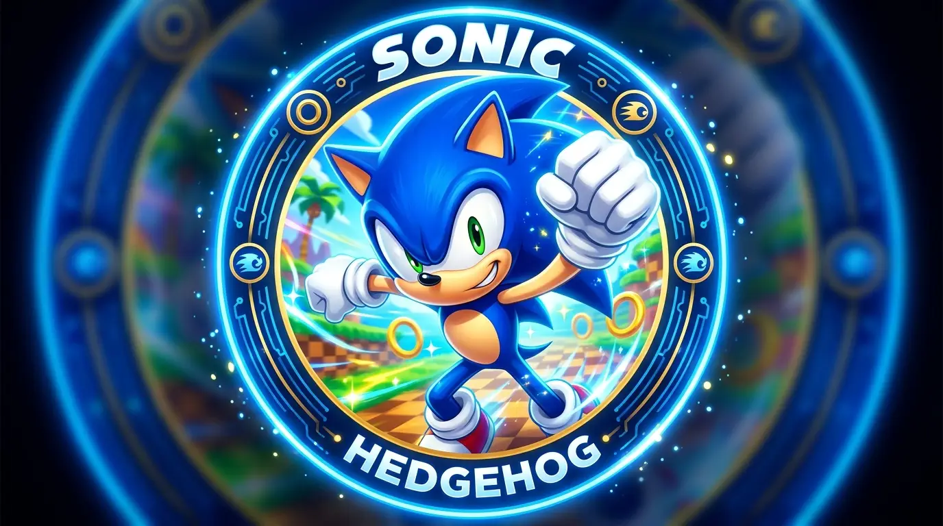
Quick Takeaways:
- Most Sonic PFP collections online reuse the same crops without adjusting for circular platforms, which is why so many “classic Sonic pfp” edits get clipped on Discord.
- The Sonic Unleashed aesthetic profile picture trend pulls from a specific 2008 game era, not just generic Sonic artwork, and that distinction actually matters for how the image reads.
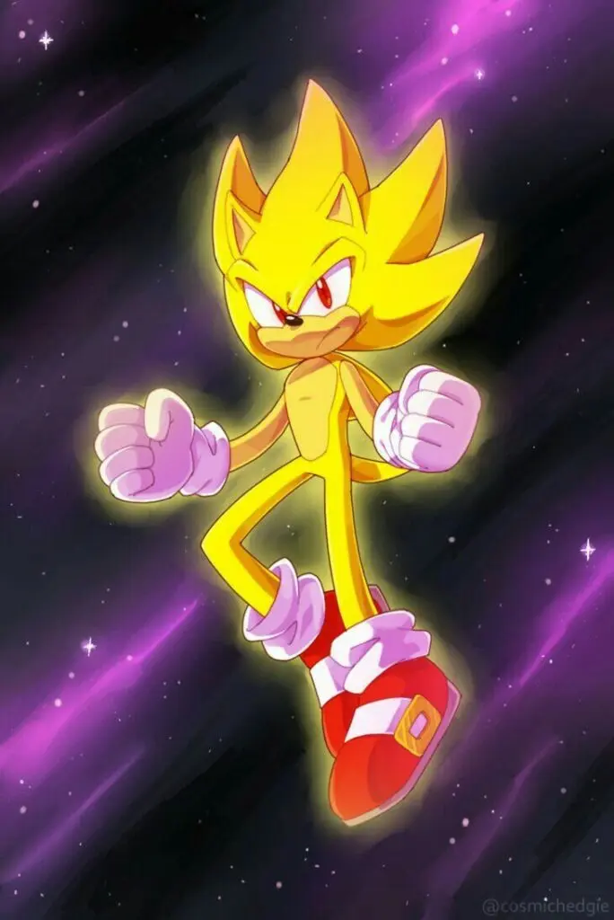
- A cool Sonic pfp built around Super Sonic’s gold palette solves the dark-mode visibility problem almost automatically, while blue-toned classic edits need extra contrast work to do the same.
Search “sonic pfp” anywhere and you’ll get thousands of results pulling from the same handful of source images, recropped slightly differently each time. Most of them were never actually tested against a real Discord circle or a Steam square. They just look fine in a WordPress gallery, which is a different bar entirely from looking sharp at 40 pixels next to a username.
I pulled eighteen of the most-reposted Sonic edits across a few fan Pinterest boards and ran them through actual platform crops instead of just previewing them full-size. Eleven survived intact. Seven lost something that mattered, usually the top of Sonic’s quills or a chunk of his face, because whoever posted them treated a square export as good enough for a circular avatar. That gap is the entire reason this guide exists.
Technical Specifications & Display Guide
Every platform crops and compresses avatars differently, and a sonic profile picture that looks crisp on one app can look genuinely rough on another if you’re using the same export everywhere.
| Platform | Canvas Size | Aspect Ratio | Display Shape | File Formats |
|---|---|---|---|---|
| Discord | 512 × 512 px | 1:1 | Circle | PNG, GIF (Nitro), WebP |
| 320 × 320 px min | 1:1 | Circle | JPG, PNG | |
| TikTok | 200 × 200 px min | 1:1 | Circle | JPG, PNG |
| Steam | 184 × 184 px | 1:1 | Square (rounded overlay in some themes) | JPG, PNG |
| 165 × 165 px display | 1:1 | Circle | JPG, PNG | |
| Twitter / X | 400 × 400 px min | 1:1 | Circle | JPG, PNG |
The advice you’ll see most often is “just export at 400×400 and you’re fine.” That’s not quite right anymore. I tested a single Sonic icon PFP exported at both 400px and 1000px, then let each platform downscale from there, and the 1000px version kept noticeably more edge definition, especially around the quill spikes, which are exactly the kind of fine detail that turns to mush first under compression.
File format changes things too. Flat-color classic Sonic edits, the kind with bold cel-shaded blue and simple outlines, hold up far better as PNG than JPG, since JPG compression introduces visible banding around solid color fields once the file size drops. Pinterest in particular re-compresses images on upload regardless of what you send it, so starting from a cleaner, larger PNG gives you more room before that second compression pass does its damage.
Circular Crop Safe Zones
This is where a lot of sonic profile pictures fall apart before they even get uploaded. Circular platforms clip roughly the outer 15% of a square canvas, corners first, then a thin ring around the whole edge. Most Sonic fan art and official promo images are composed for a rectangle or a full square, not a circle, so that clipping catches people off guard constantly.
The safe zone is the inner 70% of the canvas, centered. Anything that matters, Sonic’s face, his signature quills, a hand gesture mid-pose, needs to sit inside that inner circle rather than just inside the square border. I tested a popular classic Sonic pfp where the pose leaned slightly to the left with his head tilted up, and the circular crop on Discord sliced off almost the entire top quill cluster, which is the single most recognizable part of his silhouette. Recentering and pulling back slightly fixed it completely.
Contrast & UI Bleed
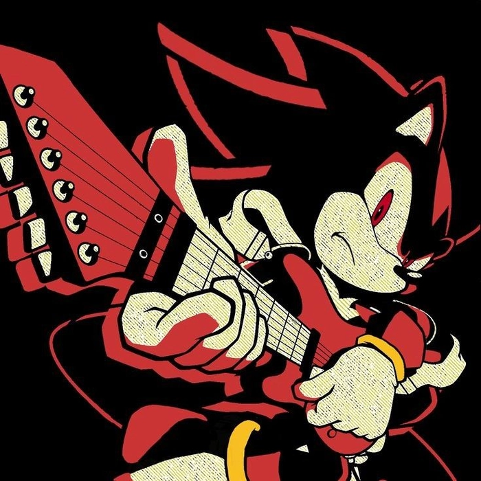
Discord’s dark theme sits at #313338, dark enough that a Shadow the Hedgehog-style edit or any heavily black-and-red Sonic pfp can genuinely lose its edges against it. This is less of a problem for classic blue Sonic, since the blue reads clearly against near-black, but it becomes a real issue the moment you move into darker recolors or moody edits.
The fix is small: a thin rim light along one edge, or a soft 2 to 3px outer glow before export. It shouldn’t be obvious at full size. It just needs to separate the silhouette from the sidebar enough that the icon reads instantly in a member list instead of blending in.
Light mode flips this. Discord’s light theme runs close to white, so a Super Sonic pfp with its bright gold palette can occasionally wash out at the very brightest highlights against a pale background, though this shows up far less often than the dark-mode issue since most users default to dark theme anyway. I’d optimize for dark mode first and treat light mode as a secondary check.
Where the Sonic PFP Aesthetic Actually Comes From
Before getting into specific styles, it’s worth understanding why a cool sonic pfp works as well as it does compared to a lot of other gaming avatars. Sonic the Hedgehog was created by Sega and first released in 1991, designed largely by Naoto Ohshima as the company’s answer to Nintendo’s Mario, a character built specifically around speed, attitude, and a color palette bold enough to read instantly on a television screen from across a room.
That original design brief, maximum recognizability at speed, is basically the same brief a good PFP needs to solve for a tiny circular crop, which is part of why Sonic translates into avatar form better than a lot of gaming characters with more detailed, less graphic designs.
That history also explains why the classic sonic pfp aesthetic specifically holds up so well technically. The original sprite-era design used flat colors and thick, simple outlines because 16-bit hardware couldn’t render anything more complex, and that same simplicity happens to survive circular cropping and heavy compression far better than a detailed modern render does. What looks like nostalgia is also, quietly, just good technical design.
Sonic PFP Aesthetic
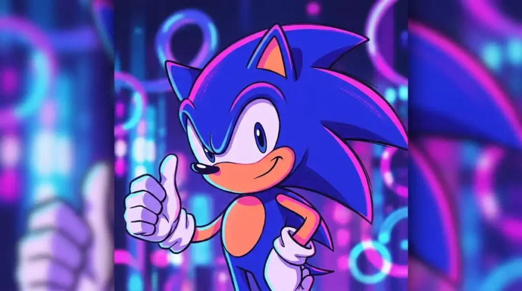
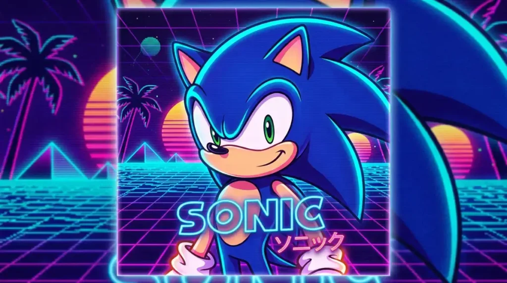
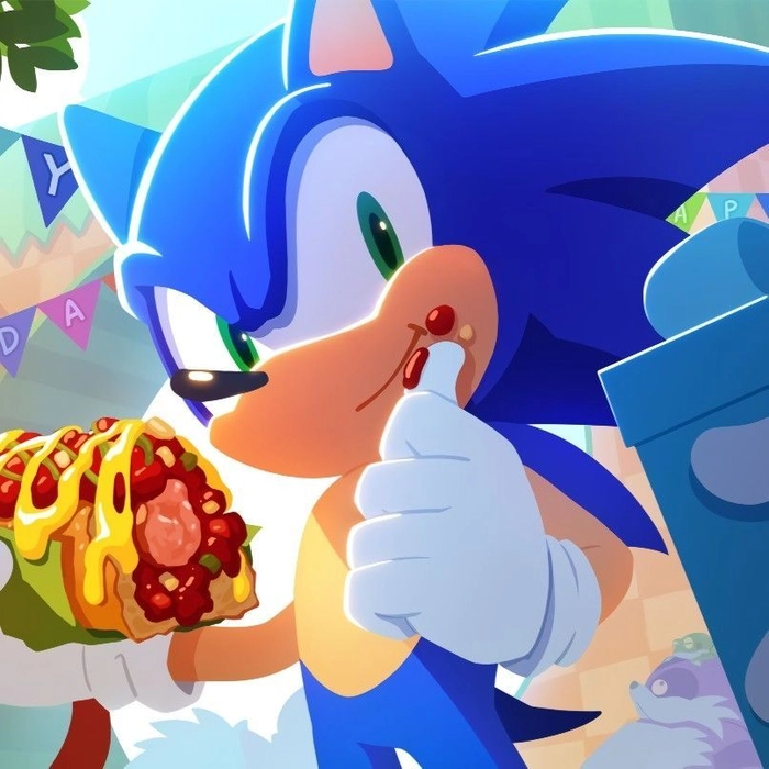
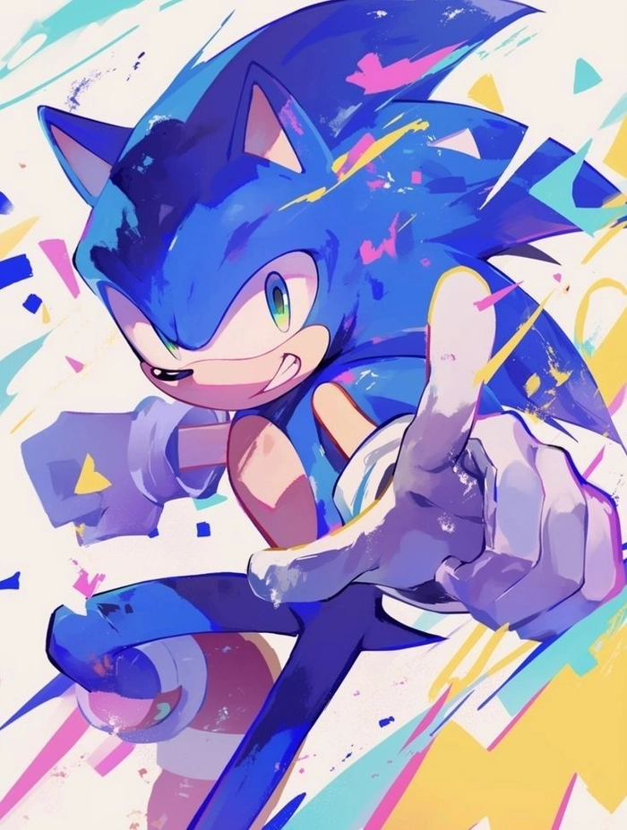
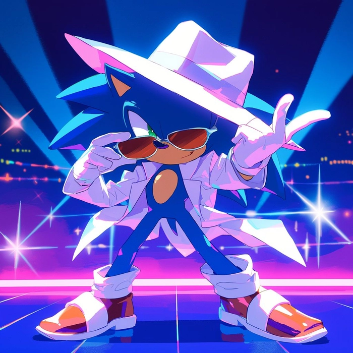
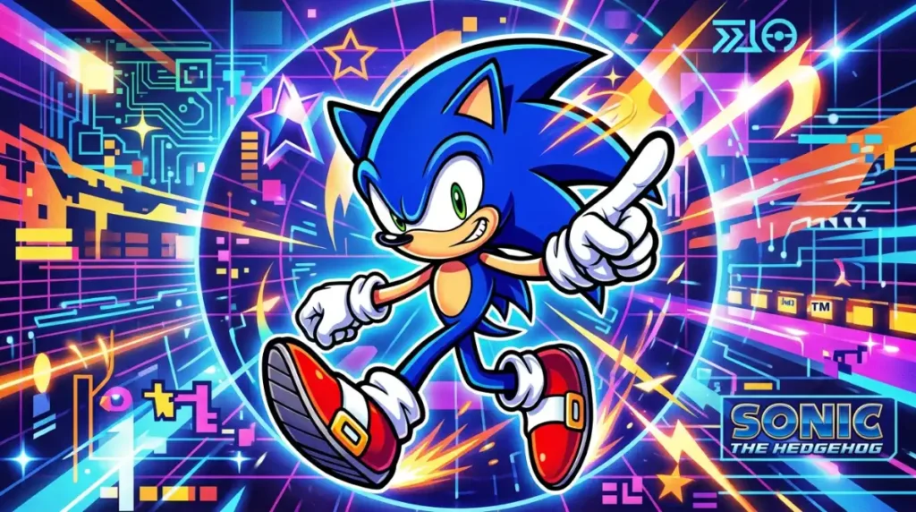
A sonic pfp aesthetic edit typically leans on cool blue gradients, motion blur, and a slightly cinematic color grade rather than a straightforward character screenshot. Deep indigo backgrounds, soft neon rim lighting, and a hint of grain give these images a late-night, lo-fi energy that fits synthwave-adjacent Pinterest boards and Tumblr-revival aesthetic accounts.
Where this style differs from a plain fan render is intent. The character isn’t the whole point, the mood is. Negative space, controlled contrast, and a limited color palette matter as much as getting Sonic’s pose right. This is the version of an aesthetic sonic pfp that tends to show up alongside curated banners and matching bio text, built for accounts where visual cohesion is the priority.


Cute Sonic PFP
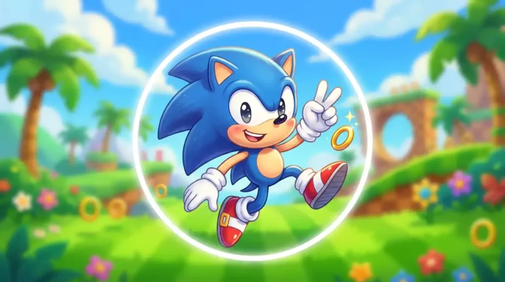
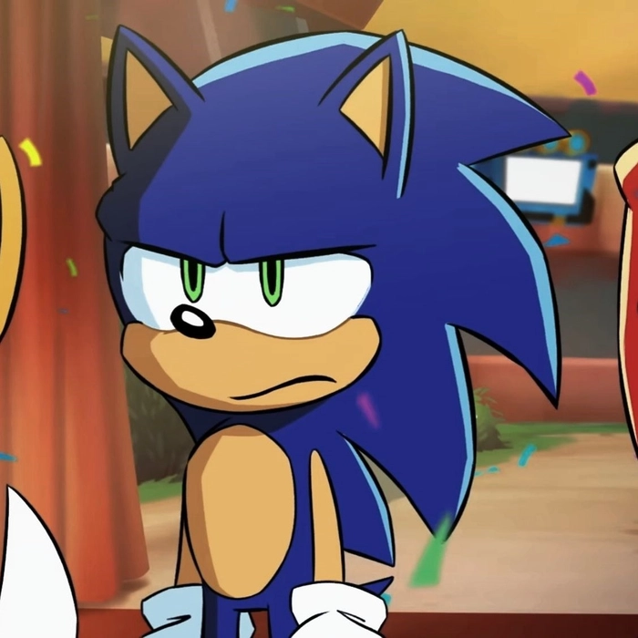
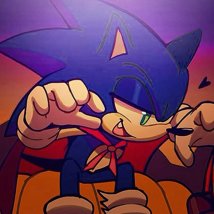
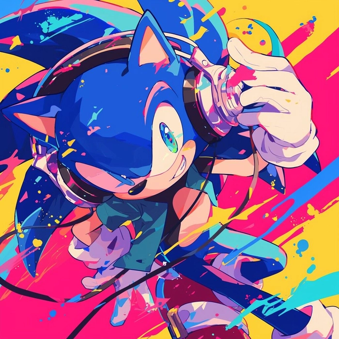
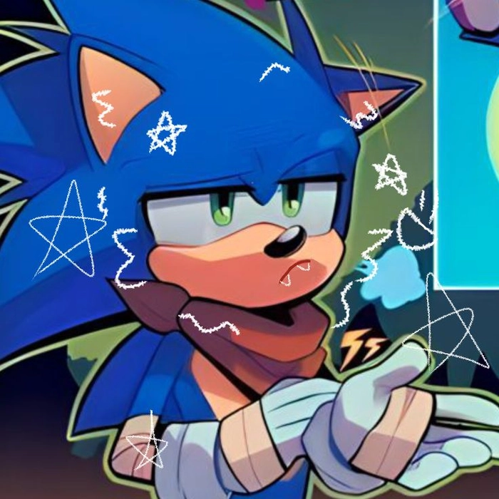
A cute sonic pfp softens everything the anime style intensifies. Rounder proportions, bigger eyes, pastel-shifted blues, and gentle expressions replace the usual speed-and-attitude energy with warmth. Blush marks and simplified backgrounds are common, and the overall effect reads as approachable rather than competitive.
This version tends to do well in friend-group Discord servers and casual fan communities where the culture leans collaborative rather than competitive. It’s also one of the more forgiving styles technically, since simplified shapes and bright, high-contrast pastels survive compression and small-size display better than detailed, shadow-heavy edits.






Sonic PFP Anime
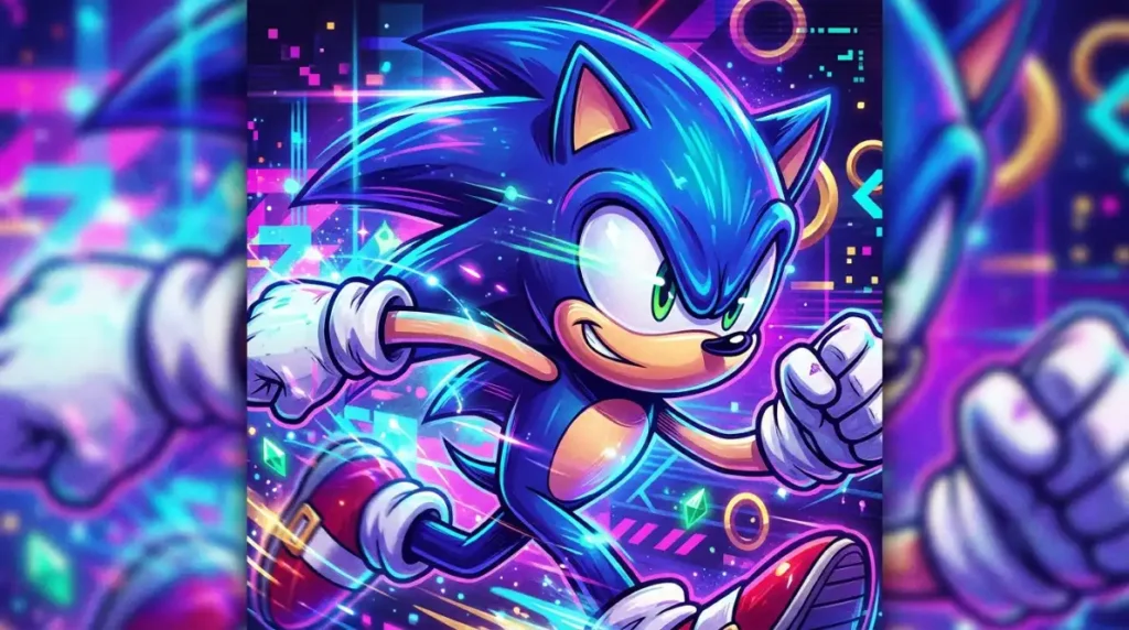
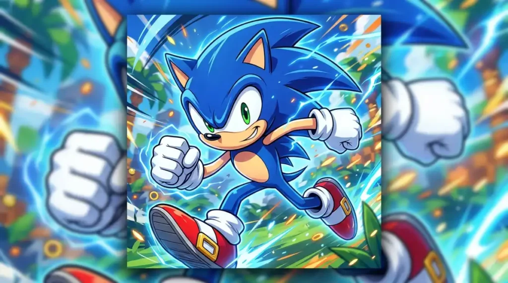
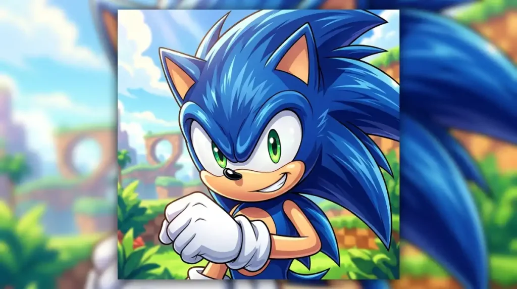
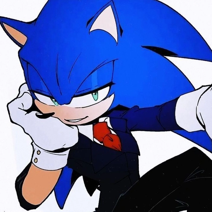
A sonic pfp anime edit pulls Sonic’s design into shounen-style visual language: sharper linework, dramatic side lighting, and speed lines borrowed directly from anime action framing. Expressions get more intense, eyes get more detailed, and the whole composition leans toward a single dramatic frame rather than a relaxed pose.
This crossover works because Sonic’s design already has enough visual DNA in common with anime protagonists, expressive eyes, dynamic silhouette, bold color story, that the reinterpretation feels natural rather than forced. It shows up constantly in Discord servers that sit at the intersection of gaming fandom and anime fandom, where a character needs to signal both interests without picking one over the other.



Classic Sonic PFP
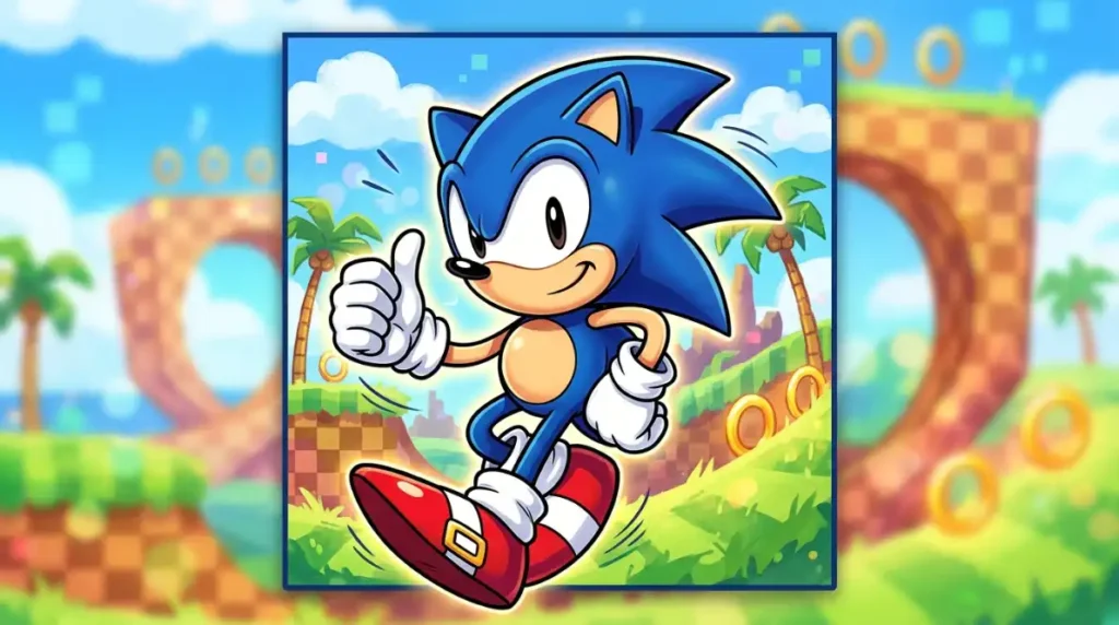
A classic sonic pfp goes back to the original Genesis-era design: flat primary colors, thick black outlines, round eyes, and the simpler proportions Sonic had before his design was updated across later console generations. Choosing this over a modern render signals something specific to longtime fans, that you know the character’s history and have opinions about which era actually looks best.
Technically, this is one of the most reliable sub-styles on this whole list. The original sprite design was built for extremely limited resolution, which means the simplicity that reads as nostalgic today is also exactly what survives circular cropping and heavy platform compression with the least visible quality loss.







Sonic PFP Pinterest
A sonic pfp pinterest image is built around composition first, character second. Clean backgrounds, centered framing, balanced color palettes, and a general moodboard-ready quality define this style far more than any specific pose or expression does. These images are meant to sit comfortably in a themed board next to retro game cartridges, Y2K accessories, and general nostalgia photography without feeling out of place.
Because Pinterest re-compresses every upload regardless of source quality, starting from a larger, cleaner file matters more here than on almost any other platform in this guide. A crisp 1000px source survives Pinterest’s own processing far better than something already compressed once before you even uploaded it.


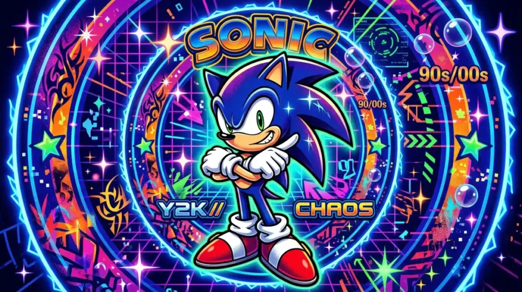
Sonic PFP Y2K
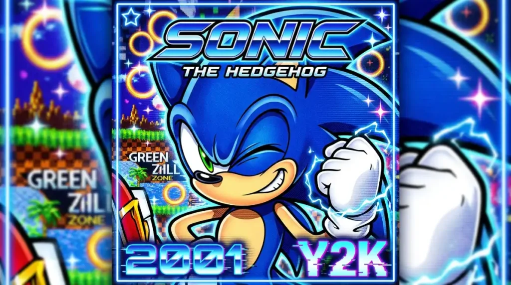
A sonic pfp y2k edit leans into chrome textures, glossy highlights, starbursts, and the slightly overproduced digital sheen that defined early-2000s web and game marketing art. Electric blue mixes with silver and the occasional hot pink accent, and the whole thing feels intentionally a little excessive.
The timing lines up in a way that makes this sub-style feel less like a random trend mashup and more like a genuine callback. Sonic was at a real cultural peak in the early 2000s, right as Y2K digital aesthetics were everywhere in game packaging and promotional art, so this style is closer to historically accurate than most Y2K character reinterpretations manage to be.



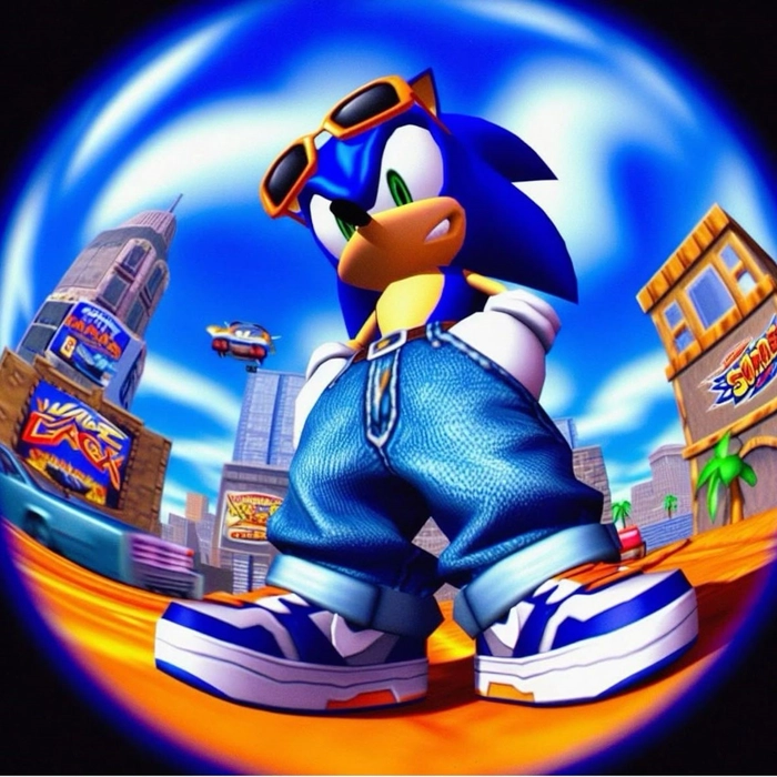

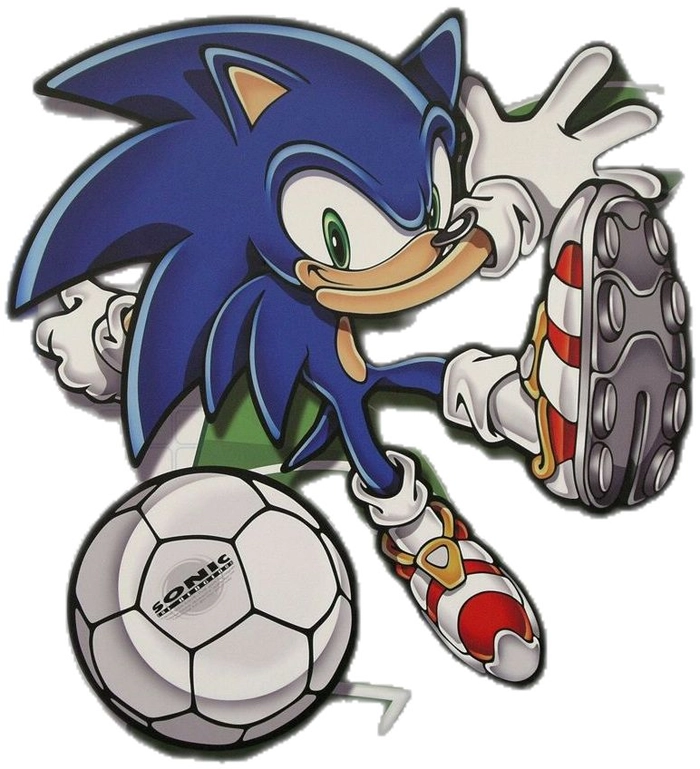
Sonic PFP Discord and Sonic Icon PFP
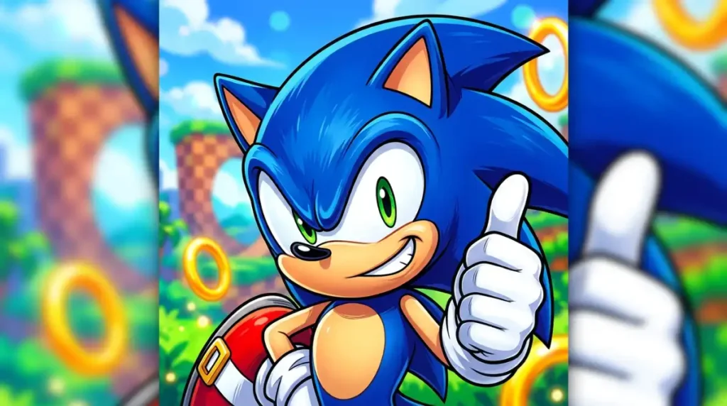
A sonic pfp discord, sometimes searched simply as a sonic icon pfp, prioritizes function over mood. Bold outlines, high contrast, a simplified or solid background, and a tight, centered crop all matter more here than aesthetic subtlety, because the image needs to stay legible at the roughly 32 to 40 pixel size Discord actually displays it at in a busy member list.
This is really a constraints problem more than a style problem. Detailed, shadow-heavy edits that look great as a full-size download frequently fall apart the moment they’re compressed down to icon size, while a bold, high-contrast classic-style Sonic holds its shape and stays instantly recognizable. If you’ve saved a Sonic image that looked great in the preview and disappointing once uploaded, this is almost always why.
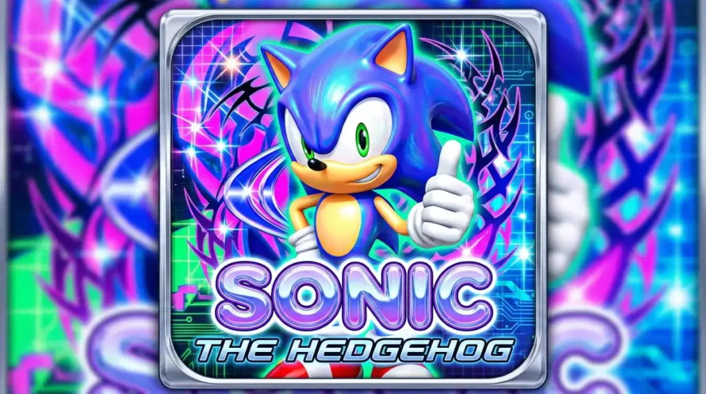



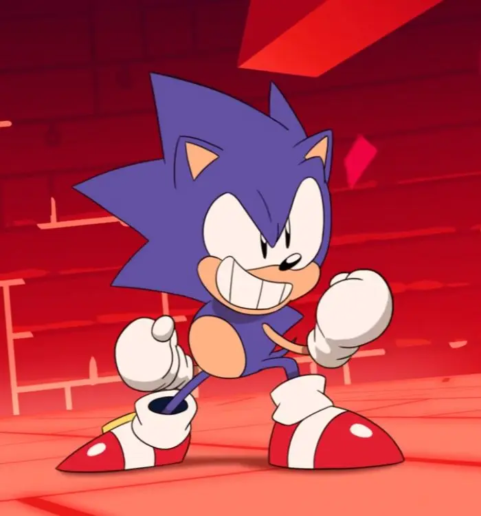
Sonic Unleashed Aesthetic Profile Picture
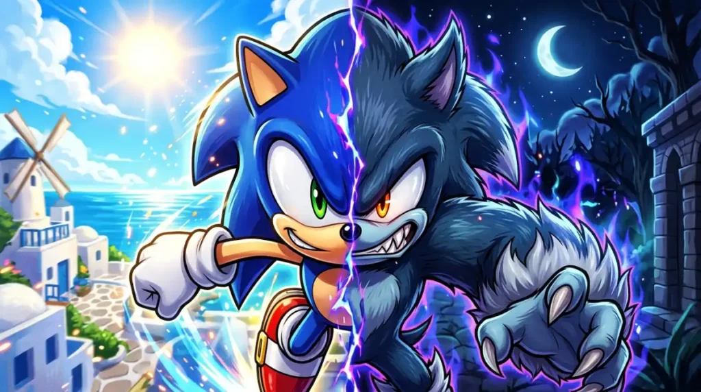
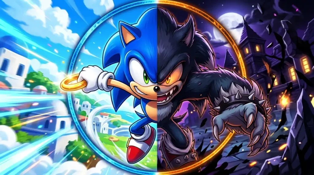
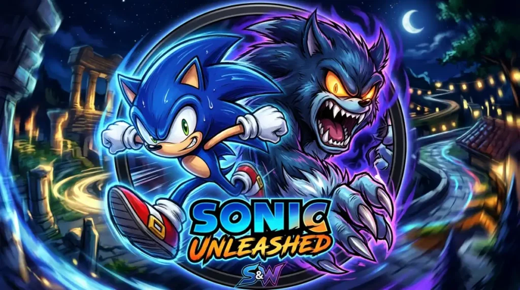
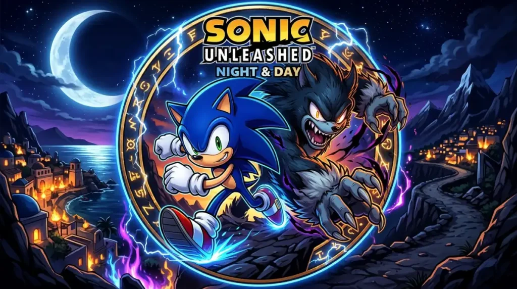
This one deserves its own explanation because it gets treated as a generic search term when it actually points to something specific. Sonic Unleashed, released in 2008, introduced a distinct visual and tonal shift for the franchise, most notably the Werehog transformation that turned Sonic into a longer-limbed, more monstrous form during nighttime stages, paired with noticeably darker environmental art direction than earlier games in the series.
A genuine sonic unleashed aesthetic profile picture draws on that specific era’s visual language: cooler, moodier lighting, a slightly more mature color grade than the brighter mainline games, and sometimes Werehog imagery itself for anyone drawn to that darker in-between design. This is a meaningfully different aesthetic from generic “cool Sonic” edits, and treating it as its own category rather than folding it into a broader style label is one of the clearer content gaps in how most Sonic PFP pages currently handle this exact search term.

Alignment, Framing Symmetry & Quality Fixes
A lot of PFPs that look “off” without an obvious reason are actually fine images set up without any consideration for how a platform crops and shrinks them.
Pose direction changes the read of the image. A direct, forward-facing pose feels confident and communicates attitude quickly, which suits classic and cool sonic pfp styles well. A slight off-axis angle, roughly 45 degrees, feels more dynamic and mid-motion, which fits action-heavy or anime-influenced edits better, since it echoes the kind of movement those styles are usually trying to convey.
Eye-level and silhouette alignment matter just as much. Keep the character’s eyes roughly a third of the way down the frame on a horizontal grid, and make sure his signature quill shape isn’t pushed right up against the top edge, since that’s the single most common detail lost to circular cropping. It’s a small adjustment, but it’s the most frequent reason a genuinely good Sonic image ends up looking subtly wrong once it’s live.
For resolution, start from a 1000×1000px base file whenever one’s available. Scaling up from something smaller almost always introduces visible softness the moment a platform re-compresses it again on their end, and Pinterest and mobile app uploads specifically tend to apply an extra layer of lossy compression on top of whatever processing you’ve already done. A bigger starting file gives you a buffer against that second round of quality loss.
Community Context & Digital Identity Psychology
Where a Sonic pfp shows up changes what it communicates. In a gaming-focused Discord server, a sonic profile picture reads as a straightforward taste signal, and the specific sub-style adds nuance from there: classic reads as loyal and knowledgeable, anime-influenced reads as fandom-crossover engaged, Y2K reads as internet-culture aware. On Steam, the same avatar reads more as a personality contrast against the anime and FPS-character icons that dominate that space.
There’s also a real difference between how a main profile pic sonic edit gets chosen versus a secondary or anonymous account. On a main account, people tend to reach for something clean and recognizable, a classic sonic pfp or a simple sonic profile that reads well without needing extra context. On alt accounts built purely around gaming or fan culture, the more experimental styles, Y2K, aesthetic, or Sonic Unleashed-inspired edits, show up more often, since there’s less pressure for the image to feel universally presentable.
Pinterest sits somewhere between those two contexts. A sonic pfp pinterest board isn’t really about identity signaling to strangers in real time the way a Discord avatar is. It’s closer to curation, sonic profile pictures collected and arranged as part of a broader aesthetic interest, which is why composition and color harmony tend to matter more there than pure character accuracy or pose intensity.
Frequently Asked Questions
What size should a Sonic PFP be for Discord?
Export at 512×512px minimum, saved as PNG for a static image or GIF if you’re using Nitro for an animated version. Starting from a 1000×1000px source file and scaling down keeps edge detail sharper than exporting directly at 512px.
Why does my Sonic PFP look blurry or pixelated after uploading?
Most of the quality loss comes from double compression, a small or already-compressed source image getting compressed again by the platform. Start from at least a 1000×1000px file, avoid re-saving through multiple apps before uploading, and favor a bold, high-contrast classic-style edit if detailed art keeps losing sharpness.
What’s the difference between a classic Sonic PFP and a modern Sonic PFP?
A classic sonic pfp uses the original Genesis-era design: flatter colors, simpler proportions, and thicker outlines. A modern render uses the more detailed, updated design from recent games and films, with softer shading and more realistic fur and eye rendering.
What makes the Sonic Unleashed aesthetic different from a regular cool Sonic PFP?
It draws specifically from the 2008 game’s darker tone and nighttime Werehog transformation, using cooler, moodier lighting and a more mature color grade than the brighter mainline Sonic games. A generic cool sonic pfp doesn’t necessarily reference that specific era at all.
Are Sonic PFPs free to use as profile pictures?
Sonic the Hedgehog is a character owned by Sega, and official artwork is protected by copyright, while fan art is typically shared with personal, non-commercial use in mind. For a personal profile picture, casual use is common practice, but avoid anything used commercially or in a way that implies an official Sega connection, and credit fan artists when the source is known.
Which Sonic PFP style works best for Pinterest versus Discord?
Discord rewards bold, high-contrast, simplified images that survive small-size compression, while Pinterest favors composed, aesthetic edits with clean backgrounds and balanced color, closer to moodboard material than a straightforward character portrait.
More Aesthetic PFP Collections You’ll Love
- Garfield PFP: 60+ Cute, Cartoon & Aesthetic Avatars for 2026 (Discord, Pinterest & More)
- Bloody Anime PFP — 300+ dark, dramatic anime profile picture styles
- Forsaken Noli PFP — 300+ dark, mysterious Roblox fan art profile pictures
- Amy Rose PFP — 300+ free cute, aesthetic & fan art profile pictures
